Color Isn’t Just Aesthetic — It’s Strategy
In a saturated apparel market, color does more than catch the eye — it builds loyalty, evokes emotion, and helps shape brand identity. For emerging U.S. clothing brands, especially those rooted in storytelling and intentional design, understanding color trends is no longer optional — it’s foundational.
As we look ahead to 2025/2026, shifts in consumer behavior, cultural moods, and generational values are directly influencing how color is perceived and adopted in fashion. From soft neutrals that signal calm and trust to bold botanical tones that express optimism and energy, the palette is evolving — and smart brands are already taking notice.
This guide combines strategic insight with practical considerations to help founders and designers apply these color trends with purpose. We’ll explore which colors are emerging, what they communicate to U.S. consumers, and how they can be translated effectively into product development — with identity and intention at the center.
1. Why Color Still Matters in 2025/2026
Color is one of the most immediate ways to build a connection with your customer. It transcends personal taste and becomes an emotional and even subconscious cue that reinforces trust, comfort, and relevance.
Following years of global instability and overstimulation, U.S. consumers are seeking calm, balance, and meaning — especially in categories like babywear, loungewear, and sleepwear. That desire is showing up in palettes that feel soft, honest, and grounded — colors that soothe without being sterile, and inspire without overwhelming.
Meanwhile, younger generations use color as a form of self-expression. They are drawn to brands that use color with clarity and intention — not just for aesthetic appeal, but as an extension of purpose and identity. In a world where consumers crave authenticity, color becomes a visual language of brand values.
More than ever, color plays a critical role in signaling who your brand is — before a word is read or a product is touched.
2. The Macro Color Stories You Should Watch
Rather than a single “color of the year,” what we’re seeing for 2025/2026 are distinct color stories — emotional groupings that reflect how people want to feel in their clothes and homes. These macro palettes reflect lifestyle shifts, mental health priorities, and a collective desire for greater meaning through aesthetics.
- Restorative Neutrals
Creams, soft taupes, off-whites, and sand tones that evoke calm, comfort, and clarity. These shades feel safe, clean, and nurturing — ideal for babywear and sleepwear, especially when paired with natural fibers like Pima cotton. They also provide a timeless foundation for brand identity. - Botanical Energy
Leafy greens, muted florals, and nature-inspired tones bring a sense of grounded optimism. These colors connect to wellness, sustainability, and softness — perfect for loungewear and unisex collections that reflect both vitality and balance. - Elevated Nostalgia
Desert pink, vintage lavender, and buttery yellow recall familiarity and warmth. They appeal to emotion, storytelling, and memory — great for limited edition collections that feel personal and intimate. These colors help small brands create emotional resonance with loyal customers. - Statement Reds & Soft Corals
Deep classic reds, warm corals, and rose terracottas signal confidence and individuality. These colors lend themselves to bold storytelling and brand presence — powerful on minimalist packaging and versatile across seasonal transitions.
These stories aren’t trends to chase — they’re tools to translate mood into design and create emotional cohesion in your collection.
3. How U.S. Consumers Connect with Color Today
In the U.S. market, color plays a dual role: it’s both personal and strategic. Brands that recognize this are the ones building stronger, longer-lasting emotional relationships with their audience.
- In babywear, gender-neutral tones consistently outperform traditional palettes, signaling inclusion, care, and trust. Consumers appreciate collections that feel nurturing and modern — not outdated or restrictive.
- In sleepwear, soft muted hues with warm undertones reinforce feelings of security and comfort. These colors enhance the user experience — calming before sleep, soft against the skin, resonant with home.
- In modern loungewear, earthy greens, dusty rose, and taupe variations strike the balance between aesthetic minimalism and nature-first appeal. Consumers want clothes that feel intentional and timeless — not throwaway.
The key takeaway: choose colors that not only reflect seasonal movement but also deepen your brand’s emotional signature. Color builds continuity, trust, and meaning across every product drop.
4. From Trend to Product: Making Color Work for Your Brand
Following trends doesn’t mean copying palettes — it means translating what’s resonating in culture into your own brand story. That takes thought, consistency, and an understanding of your customer’s emotional triggers.
At The Pima Company, we help brands turn color trends into production-ready decisions:
- Choosing hues that complement the natural softness and sheen of Pima cotton
- Adjusting saturation levels for longevity and printing clarity
- Selecting palettes that scale easily across product categories, capsule drops, and seasonal transitions
Color also plays a key role in inventory management and product storytelling. A well-chosen palette supports smart MOQ planning, cohesive merchandising, and powerful storytelling through photography and packaging.
We support founders who use color to test ideas, communicate emotions, and differentiate themselves in a crowded visual landscape — because the right color doesn’t just elevate your product. It elevates your entire brand experience.
Color isn’t just seen. It’s felt. And when chosen well, it becomes unforgettable.
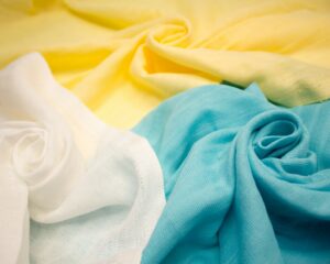
Spotlight: Butter Yellow & TPC’s Exclusive Gingham Launch
One color in particular is rising to the top of the conversation for 2025: Butter Yellow, officially recognized as Pantone 11-0616 TPX. This soft, comforting tone strikes a rare balance between warmth and neutrality. It embodies optimism, safety, and a subtle vintage familiarity — making it ideal for babywear, loungewear, and lifestyle collections that prioritize emotional connection.
What makes this hue especially exciting is its adaptability. Butter Yellow works beautifully on natural fabrics like Pima cotton, where its softness can be both seen and felt. It pairs well with taupes, off-whites, soft greens, and warm neutrals, allowing for flexibility in collection planning.
Gingham — the timeless check pattern — adds texture and visual storytelling to this already rich color, making it both modern and nostalgic. Whether used for trims, full garments, or capsule accents, this color-story-meets-pattern combination is a chance to embrace trend with integrity.
5. Color Is the First Story Your Brand Tells
For an emerging apparel brand, your color palette is more than a creative decision — it’s your first promise to the customer. It shows your eye, your care, your intention.
Intentional color use helps position your product, strengthen recognition, and create emotional continuity across your collection. It enhances how customers remember your brand — and how they describe it to others.
At The Pima Company, we work with brands that aren’t just producing — they’re building something meaningful. And that journey often begins with choosing the right color story: one that aligns with your values and connects with your audience’s reality.
In 2025/2026, color will continue to define how brands are remembered.
Let’s make sure yours speaks clearly.